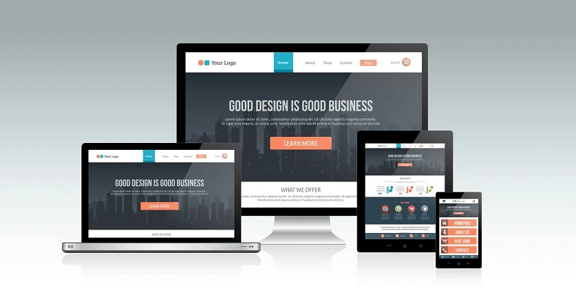
1. Responsive and mobile-friendly WordPress themes are both designed to ensure that a website looks and functions well on mobile devices, but they have some key differences:
a. Responsive WordPress Themes:
- A responsive theme is designed to adapt to different screen sizes and resolutions, making it accessible and visually appealing on various devices, including desktops, laptops, tablets, and smartphones.
- It uses CSS (Cascading Style Sheets) and HTML to fluidly resize and reorganize the content and layout to fit the screen. Elements on the page automatically adjust their size and position based on the available screen real estate.
- Responsive themes are often considered a best practice for web design because they provide a consistent and user-friendly experience across different devices.
- They require less maintenance, as you only need one website that works well on all devices, reducing the need for separate mobile versions of your site.
b. Mobile-Friendly WordPress Themes:
- A mobile-friendly theme is specifically designed to optimize the user experience on mobile devices. It may have a separate mobile layout or design for smaller screens.
- These themes often have larger touch targets, simplified navigation, and other mobile-specific features to enhance the mobile user experience.
- Mobile-friendly themes can be less flexible than responsive themes, as they may not adapt as seamlessly to different screen sizes and orientations.
2. In summary, responsive themes are more versatile and recommended in most cases because they provide a consistent experience across all devices. They use fluid design principles to automatically adjust content to the screen, eliminating the need for multiple versions of your site. Mobile-friendly themes, on the other hand, are more focused on optimizing the experience for mobile users, and they may be a better choice if your website has specific mobile design requirements or if you have a separate mobile audience to cater to.
3. When choosing a theme for your WordPress website, consider your target audience, the devices they use, and your design preferences to determine whether a responsive or mobile-friendly theme is the better fit for your needs.
Lorem ipsum is simply dummy text of the printing and typesetting industry. Lorem Ipsum has been the industry’s standard dummy text ever since.
Ipsum lorem is simply dummy text of the printing and typesetting industry. Lorem Ipsum has been the industry’s standard dummy text ever since.